BioPharm Advisors
Website
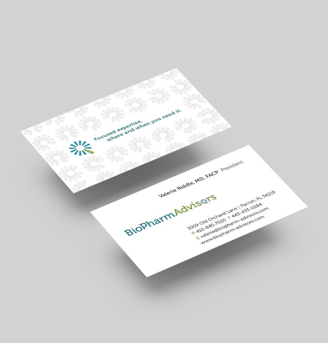
Business Card
The Challenge
Design a branding package that differentiates a new consultancy in the crowded biotech, medical, and pharmaceutical industry. The consultancy was set up with the goal of closing the gaps of expertise that many of the companies in these industries were dealing with.
My Solution
After researching competitors, I chose an illustrative/graphic approach for the main visuals of the website. This allowed me to better communicate BioPharm Advisors’ message in a more creative and engaging way rather than relying on photography that would too closely resemble competitors marketing.
The logo uses the concept of a wheel incorporated into the letter “O” with a missing spoke for the gap in existing support. The large green spoke in the wheel of the logo represents BioPharm Advisors’ ability to seamlessly fill in the knowledge gaps.


